17 ideas |
In Progress
|
|
-Frozen yogurt - Burger and Fries -Ham sandwich and chips -BLT and chips -Supreme pizza -Peeled mandarin orange -bowl of spaghetti -Loaf of bread -Baguette -Salmon with a vegetable -Pineapple -Baked Potato -Ice cream cone -Tori, cause she's a snack -Rattatoui -Chik-fil-a in a container -Waffle fries |
3 In progress pictures were on an iPod touch that no longer works. Most of the pixels died and the ones that didn't were no longer touch sensitive.
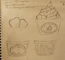
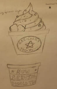
Sketches
|
|
|
The references used were the same I the one I used for the Pen and Ink one. I had some frozen yogurt pictures saved in my google drive.
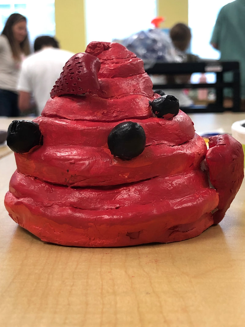
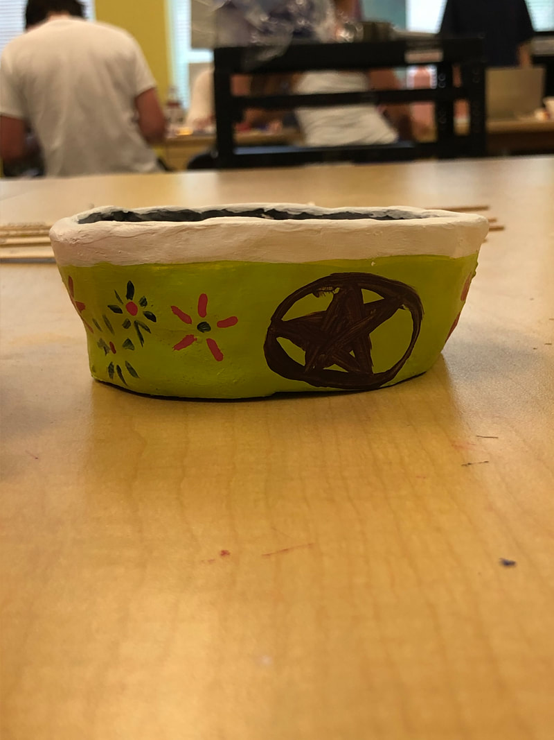
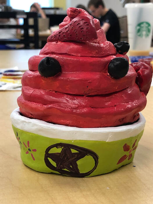
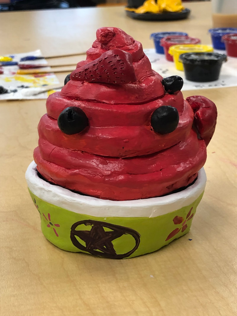
Final Pieces
|
|
|
|
Self-Critique
1. This is the first time I've ever done clay work, so my craftsmanship pretty much fits that. It's too wide toward the middle, and the cup and the yogurt do not match up anymore.
2. It was very hard to make the shape of the frozen yogurt, and in the end I don't think it looks like what I imagined.
3. I think my color choices worked well together. I used the colors of an actual cup of frozen yogurt I got from My Berry last week. I intentionally made both the cup and the yogurt brighter colors. And I think the light green works wee
4. One side of the cone is much more flat, which means I couldn't put as much stuff on it so the side opposite of it has much more detail.
5. While constructing a sculpture you have to focus on ALL the angles and not just the one that people can see. So you have to make sure the whole sculpture is consistent with the rest of it. As well as you have to make sure the whole thing looks well in the first place.
6. When I was doing the strawberries I cut out a lot of mini holes in them to represent where seeds would be and this creates some texture. I don't really think I created texture in a lot of the piece though.
7, Well I think it looks like frozen yogurt, but it's probably due to it's shape. I think having the fruit on it helped make it clearer as to what is was. With out it, it would look like a big red swirl.
8, I would make the frozen yogurt its self much smaller so it fit in the bowl better. As well as making the bowl, and the dome the frozen yogurt sits on much smoother so it looks less lopsided.
